In-Depth
The overall campaign branding reflects the playful nature of the Crayola Brand in its bright primary and secondary color choices and playful typography. The campaign uses a new wordmark to brand itself with the Target collaboration. This wordmark incorporates this colorful aspect and introduces playful dynamic elements with its rotated orientation and modified ascenders and tails. The wordmark keeps a page split aspect to frame the contents of the collateral within the document, stopping the viewer eye from leaving.
Addressing the characters, taking inspiration from organic sources and organic architecture was important in promoting the idea of sustainability and referencing the earth. These characters appear in many forms and orientations and allow the child to put their own narrative onto the characters. They also serve as recognizable mascots that will standout as being uniquely Crayola with bright colors. The AR application/game will act as a partner to the program and integrate the mascots used in the Color-Cycle program with the game.
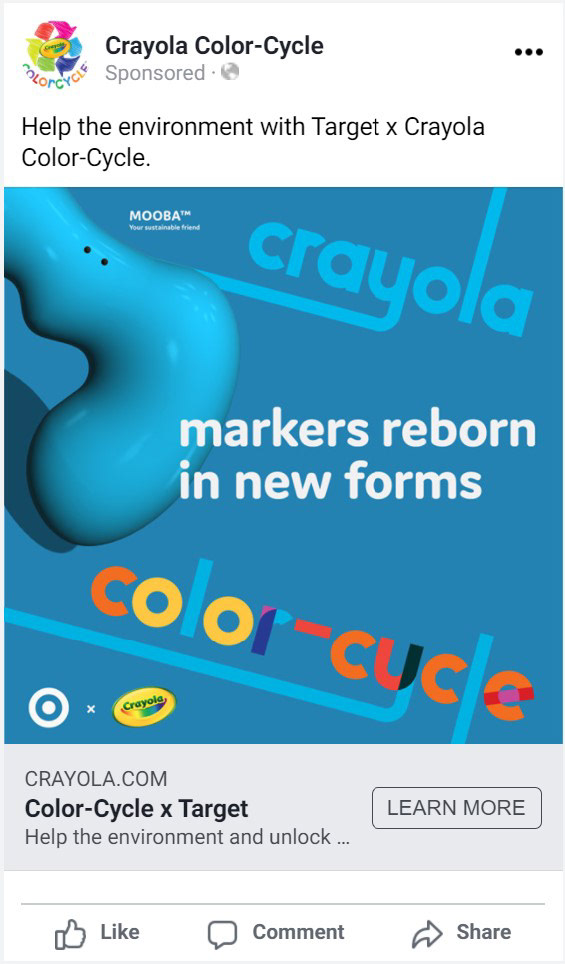
Mooba Facebook Ad.
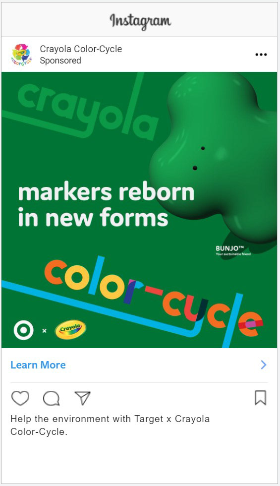
Bunjo Instagram Ad.
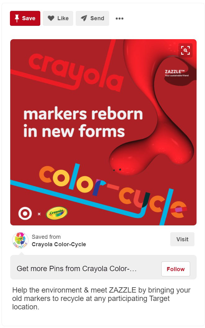
Zazzle Pinterest Ad.
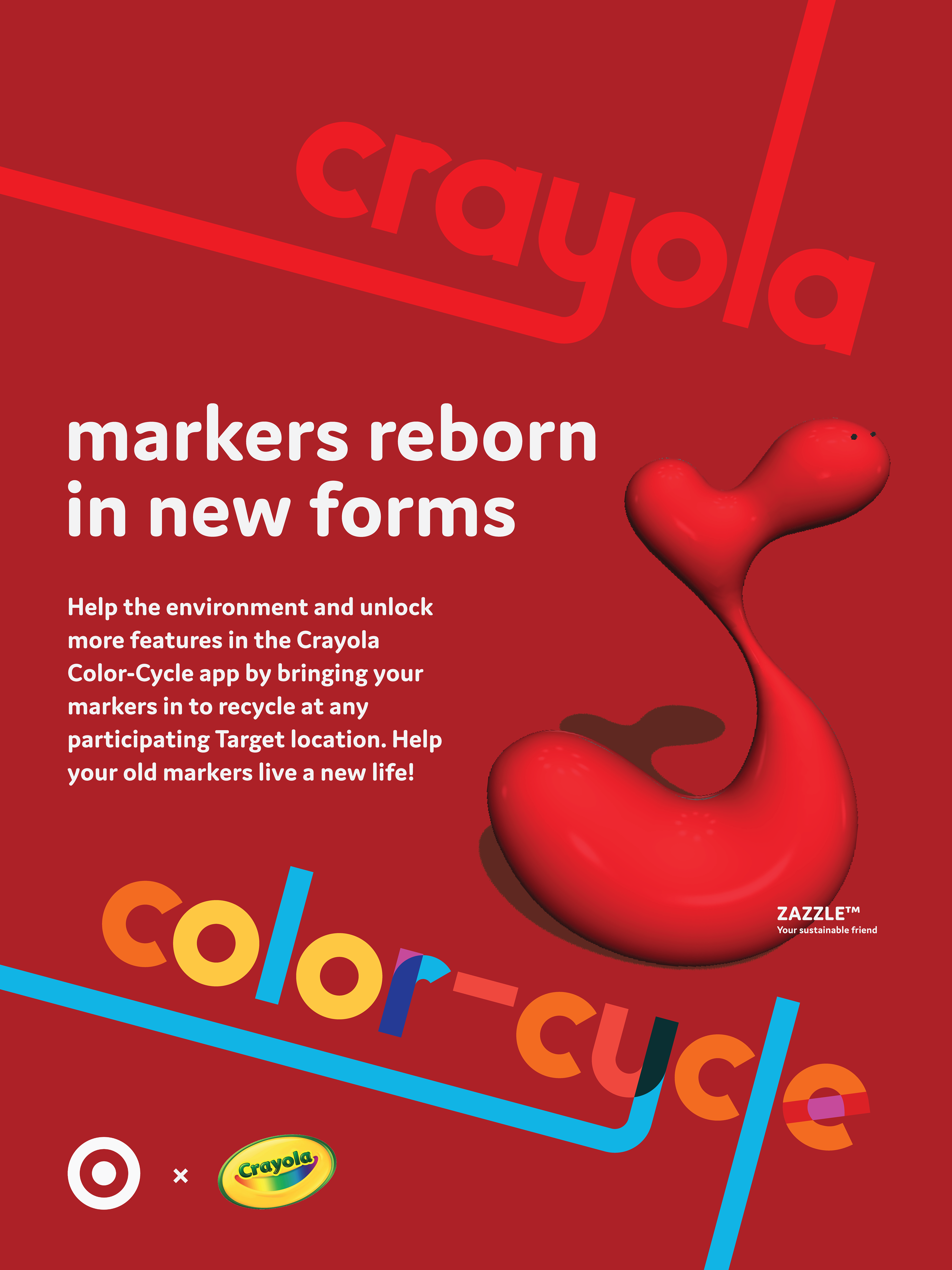
Zazzle Poster
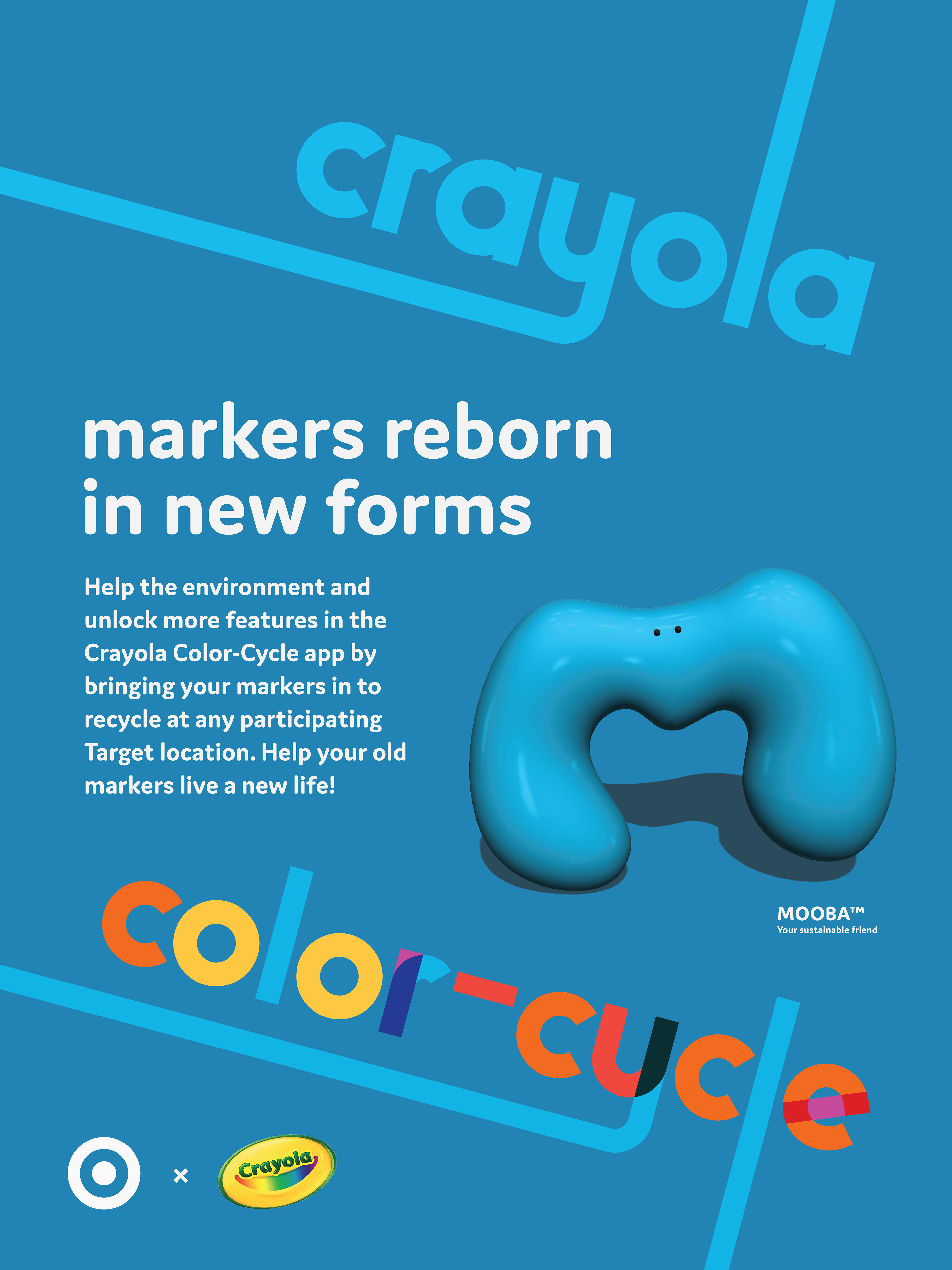
Mooba Poster
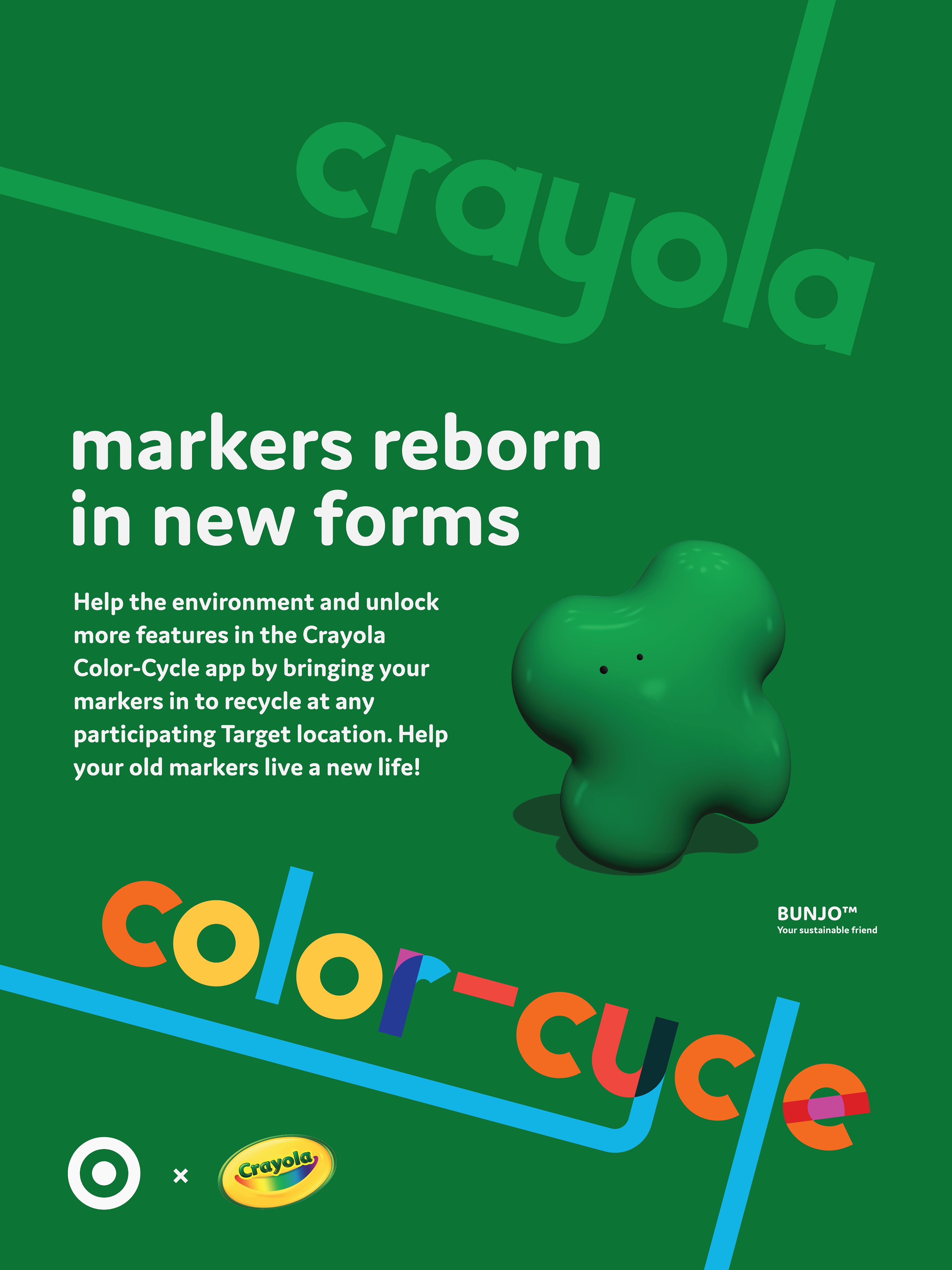
Bunjo Poster
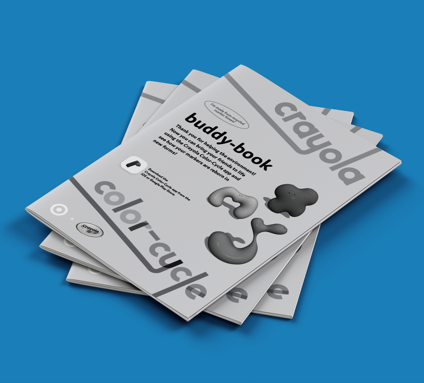
Coloring Book Cover
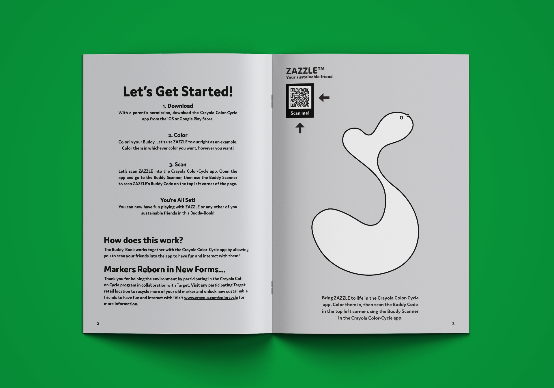
Coloring Book Interior
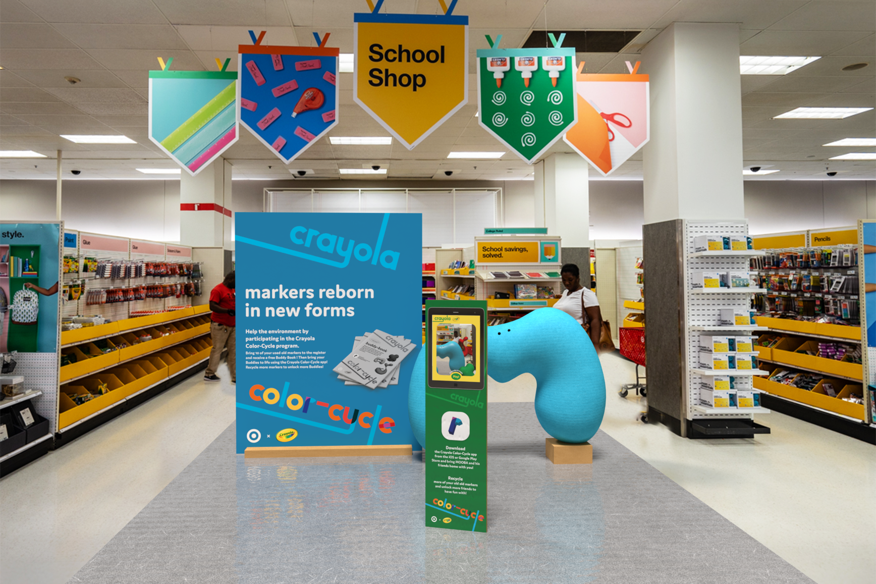
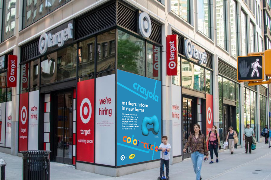
Store Display
AR Sample